What Are the Benefits of Having a Fun, Bright Interior Paint Color?
Last Updated: February 27, 2016
One of the most popular paint colors today is off-white. There’s nothing particularly wrong with this; off-white, and its huge, extended family of warmer and cooler cousins, is a versatile and attractive color.
Occasionally, however, it’s fun to step out a little and walk on the wilder, bolder side of paint.
In addition to simply offering visual variety and something to chat about with dinner guests, more assertive paint colors can be chosen to have a valuable, strategic impact.
A quick practical note: “bright” doesn’t have to mean neon. A clean, saturated blue, a crisp yellow, or a well-chosen green can feel energetic and modern without overwhelming the room—especially when the rest of the palette is kept simple.
The World of Color Psychology - What Does Your Paint Do for You?
Color psychology tells us that colors are rarely neutral, at least in the way they impact us. They actually have a profound effect.
Let’s take a closer look.
Red
Did you know that bright red walls have actually been shown to increase heart rates? That’s a measurable impact if there ever was one. Because of this, a bold red is often better limited to an accent color rather than being the primary color.
Red can be a great “punch” color in the right spot: a single accent wall, a front nook, a dining area, or even a small hallway. Used in moderation, it can feel vibrant and confident. Used everywhere, it can start to feel intense—especially in rooms where you’re trying to relax.
Blue
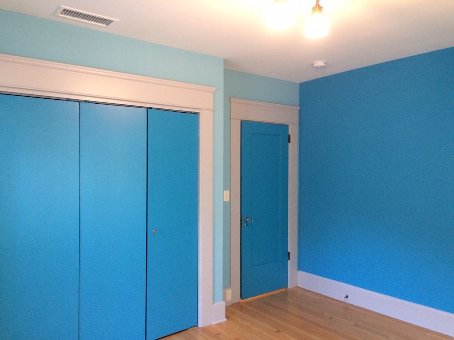
Blue promotes calm, focus, and idea generation. If it’s too dominant, however, it can turn a corner and begin to feel cool and a little depressing. The room above is an example of a well-chosen blue: these particular shades are brighter, invigorating, and there is a nice variety. Our Marty painted this room recently and did a terrific job!
Blue is also one of those colors where undertones matter a lot. Some blues lean gray and feel more subdued. Others lean green and feel coastal. Others are bright and crisp. The goal is to pick a blue that supports the mood you want, then balance it with trim, decor, and lighting that keep the room feeling inviting.
Yellow
This is an energetic color, but not quite as powerful as red. Yellow livens things up a bit, and promotes a positive brand of energy and motivation.
Yellow is often a favorite for kitchens, breakfast nooks, play spaces, and other areas where you want things to feel bright and upbeat. In very sunny rooms, though, a super-saturated yellow can sometimes feel louder than expected—so it’s worth considering how much natural light the space gets throughout the day.
Green
Green, along with other natural tones, promotes a sense of calm and well-being. As one of the most versatile bold colors, it can feel fresh and lively, calm and botanical, or warm and grounded depending on the shade and saturation. This flexibility makes green a great choice for living rooms, bedrooms, and offices when you want something more interesting than a neutral without overwhelming the space.
While color psychology generally holds true, the effect also depends on how the color is used and the function of the room. Subdued tones work well for focused spaces like offices or study areas, while brighter shades suit creative or active environments. If you like a bold color but want to keep the room balanced, consider using it as an accent on a single wall, built-ins, ceilings, or trim to add personality without making the space feel too busy.
Can We Help with Your Home Painting Project?
If you are painting your San Diego home, inside or out, and need professional help with
interior painting, the team here at Chism Brothers Painting would love to be of service. Why not contact us today?

Tell us about your project
Tell Us About Your Project


Contact us today to schedule a visit from one of our estimators! We’ll come to your home and provide a detailed estimate.
(858) 454-3850
